
 Webpop Design Marketing Team
“Above the fold” refers to the part of a webpage a visitor can see before scrolling. It usually includes the header, navigation, hero section, headline, supporting text, main image and primary call to action.
The phrase comes from print newspapers, where the most important stories were placed on the top half of the front page. In web design and development, the idea is similar, but the rules have changed. A website no longer has one fixed fold. What appears above the fold depends on the device, screen height, browser settings, font size and layout.
The fold still matters; it just means the first screen needs more thought than it used to. Visitors should be able to understand the page quickly, trust what they are seeing and know what to do next. If the first screen feels vague, slow, cluttered or generic, many users will leave before they reach the stronger content further down.
Key Facts About "Above The Fold" Content
- “Above the fold” means the part of a webpage people can see before scrolling.
- There is no fixed fold because screen sizes, browsers and devices all vary.
- Mobile design has made above-the-fold planning more important, not less.
- The first screen should quickly explain where the visitor is, why it matters and what they can do next.
- Users do scroll, but only when the first screen gives them a reason to continue.
- Above-the-fold content can support SEO when it improves clarity, usefulness and page experience.
- The best websites balance a strong first impression with useful content further down the page.
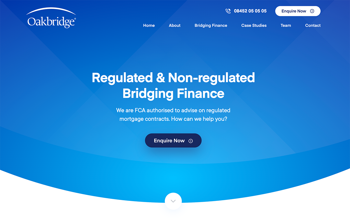
A clear first screen should introduce the offer, build trust and guide users forward, as shown in our Oakbridge project.
What Does Above the Fold Mean?
Above the Fold Definition
Above the fold means the content visible on a webpage before the user scrolls. On a typical homepage, service page or landing page, this usually includes the top navigation, headline, short introduction, visual content and one or two important actions.
For a service business, that might mean a clear statement of what the company does, who it helps and why it is credible. For an ecommerce website, it might mean product value, delivery reassurance, reviews and a route into shopping. For a blog article, it might mean a clear title, useful introduction and enough context to show the reader they are in the right place.
Where Is the Fold on a Website?
There is no single fold line on a modern website. A desktop user with a large monitor will see more content than someone using a small laptop. A mobile user may only see the logo, menu, headline and part of the hero section before scrolling.
This is why modern above-the-fold design should focus on priority rather than exact position. The goal is not to cram every important message into the first screen, but to make that screen clear enough to earn the next scroll.
Above the Fold vs Below the Fold
Above the fold is the content users see first. Below the fold is the content they reach after scrolling.
Neither area should be treated in isolation. The first screen should create clarity and confidence. The content below the fold should then build the case with detail, proof, explanation, examples and reassurance.
Does Above the Fold Still Matter in 2026?
Users Scroll, but First Impressions Still Matter
Above the fold still matters because it shapes the first impression. Visitors use the first few seconds to decide whether a page looks relevant, trustworthy and worth their time.
That does not mean every user expects the whole answer instantly. People are used to scrolling, especially on mobile. Scrolling itself is not the problem. The real question is whether the page gives them enough confidence to continue.
A strong above-the-fold section should answer three questions quickly:
- Am I in the right place?
- Can I trust this website?
- What should I do next?
How Mobile Changed Above-the-Fold Design
Mobile devices have made the fold more fluid. On a small screen, there is less room for long headlines, large menus, trust badges, imagery and multiple buttons. That means hierarchy matters more.
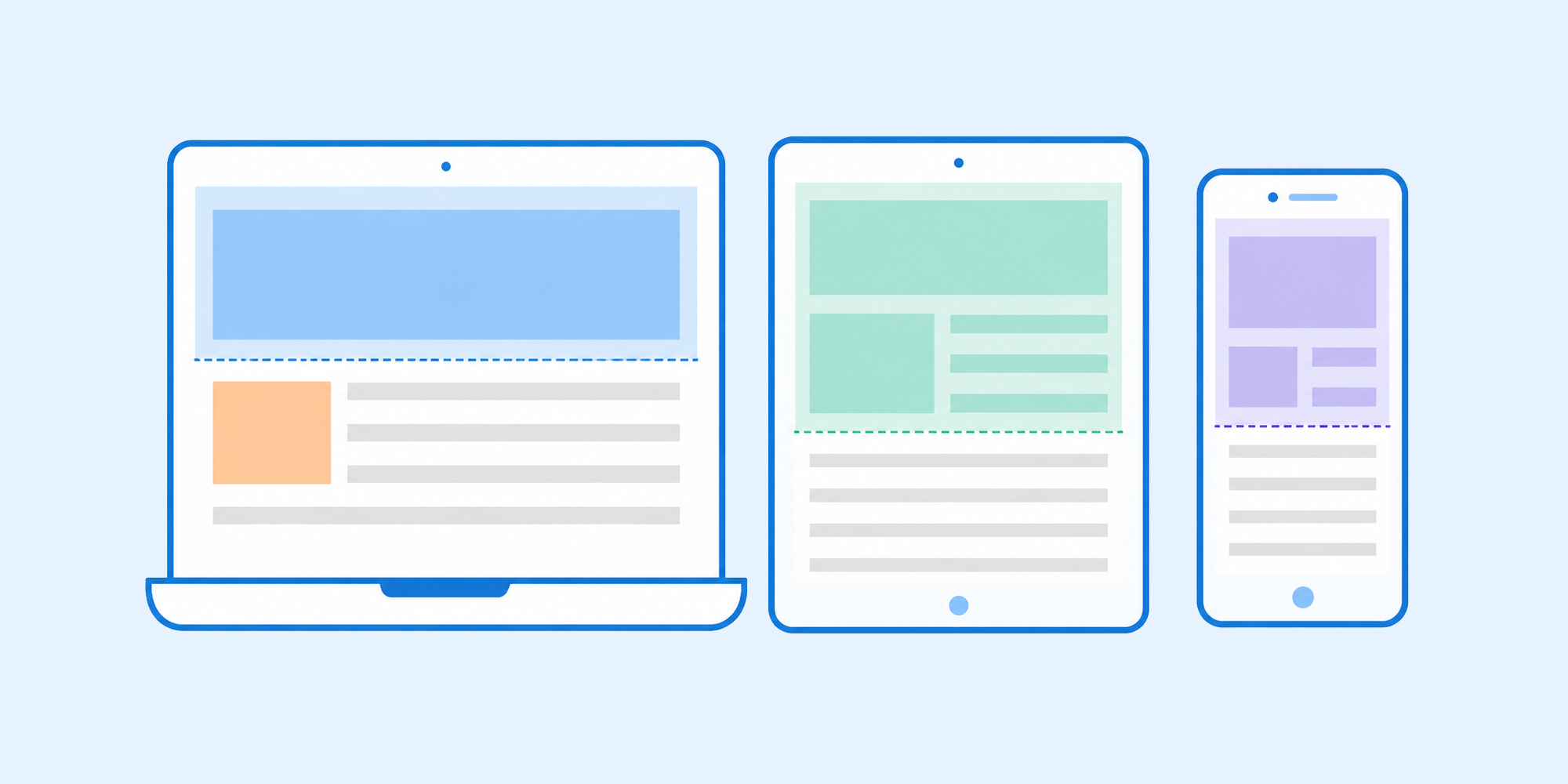
The fold changes across devices, so the first screen should focus on priority, not fixed height.
On mobile, the top of the page should usually prioritise the headline, a short supporting message and a clear action. Secondary details can sit just below the fold, as long as the first screen makes the page feel relevant.
Mobile design is about prioritising, not deleting: decide what the user needs first, then arrange the rest in a logical order.
Why Hierarchy Matters More Than a Fixed Fold Line
The fold works better as a priority area than as a precise design boundary. The first screen should introduce the page, set expectations and guide the user towards the next logical step.
This is where we see a lot of websites go wrong. They either overload the hero section with competing messages, or they lean on a large image that carries very little useful information. Both weaken the user journey.
Why Above-the-Fold Content Matters in Web Design
How the First Screen Affects User Behaviour
When the first screen is doing its job, it helps users orientate themselves. It gives the page structure and makes the next action feel obvious.
Poor above-the-fold content often does the opposite. Large empty hero images, vague headlines, hidden navigation, weak calls to action and slow-loading visuals can all create friction. The user may not know what the business offers, whether it suits them or where to go next.
An effective web design or refresh has to do more than look good. The first screen needs to support the page’s commercial goal, whether that is an enquiry, booking, purchase, download, sign-up or continued reading.
How Above-the-Fold Design Affects Conversions
Above-the-fold design has a strong influence on conversions, because it controls what users see before they make their first decision. A clear headline, relevant proof and obvious next step reduce hesitation. A weak first screen leaves users unsure, even if the rest of the page is well written.
This is especially important for high-value services, where visitors often need confidence before they enquire. The first screen does not need to close the sale on its own, but it should make the page feel credible enough to keep reading.
Take Oakbridge, the bridging finance homepage shown above. That visitor is usually a broker or borrower working to a deadline on a high-value short-term loan, so the first screen puts the offer and a direct enquiry route in front of them straight away, rather than opening with a long brand introduction. At that value, people need to see credibility and a clear way to make contact before they will read on.
What Should Be Above the Fold on a Website?
Core Above-the-Fold Elements
The right above-the-fold content depends on the page type, but most strong first screens include a few core elements:
- A clear headline that explains the page, service, product or offer.
- Short supporting copy that adds context and value.
- A primary call to action, such as requesting a quote, booking a call or viewing products.
- A relevant image, product shot, interface preview, video still or visual cue.
- Simple navigation that helps users move around the site.
- A trust signal, such as reviews, experience, client names, accreditations or delivery reassurance.
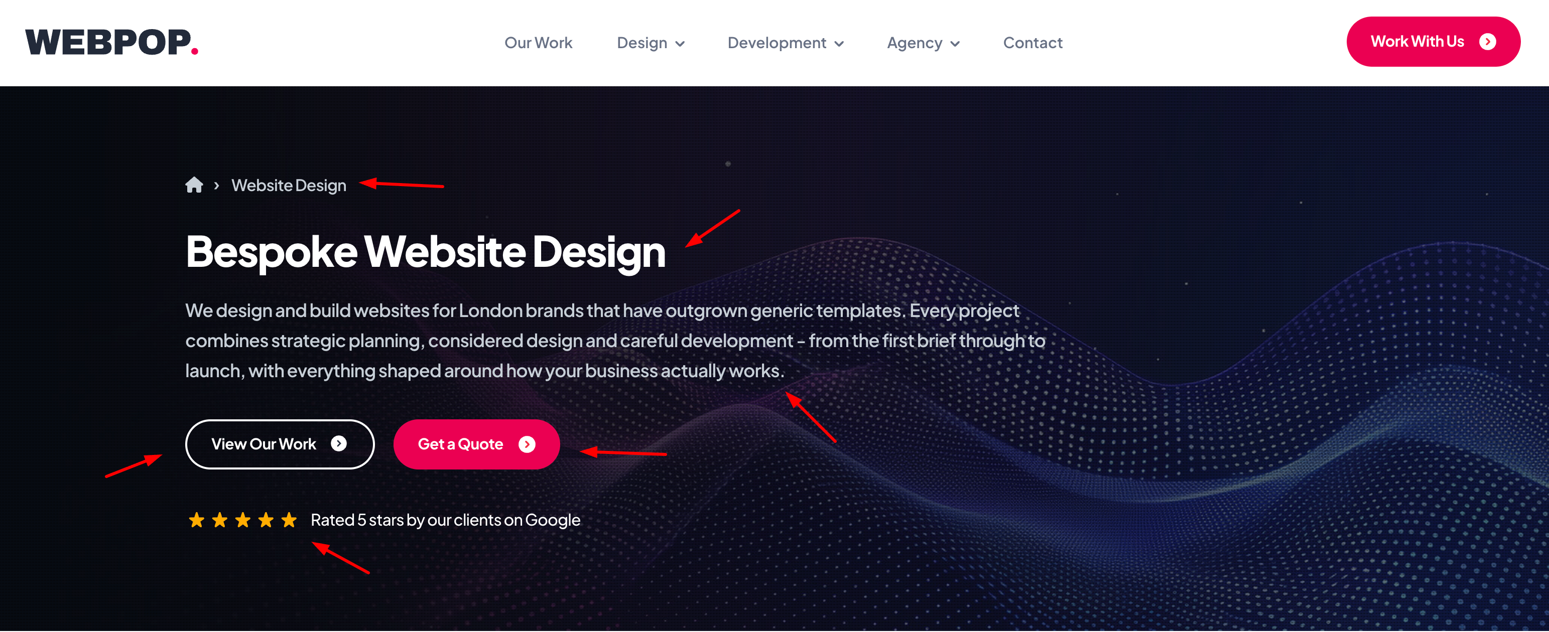
A strong first screen combines clear positioning, visible actions and trust signals to guide visitors forward.
Strong above-the-fold sections are selective. Rather than cramming everything in, they focus on the information most likely to help the visitor make their next decision.
Because we build bespoke WordPress themes with Advanced Custom Fields, we can set the order and emphasis of these elements per page type, so a finance homepage hero is structured differently from a product page rather than dropped into one fixed layout.
What Should Not Be Above the Fold?
Weak above-the-fold sections often fail because they try to do too much, or because they do not say anything specific enough.
Common mistakes include vague headlines, oversized stock images, too many competing buttons, carousels with important messages hidden on later slides, intrusive pop-ups, excessive adverts and hero sections that look attractive but explain very little.
Another common problem is the “false bottom”, where the first screen looks like the whole page has ended. This can stop people scrolling, even when useful content exists further down. Visual cues, partial next sections and clear layout flow can help users understand that there is more to explore.
Should Your CTA Be Above the Fold?
Most commercial pages should include a clear action near the top, but the type of CTA depends on the page and the visitor’s intent.
A simple ecommerce product page may need an add-to-basket button above the fold. A service page often needs a softer action, such as booking a call, viewing work or reading more about the process. On the high-value projects we build, we will often hold the hard sell back: if someone is choosing a web design agency or a finance provider, a pushy prompt before they trust you usually does more harm than good. The CTA should match the level of trust the visitor actually has at that point.
Above the Fold and SEO
Does Above-the-Fold Content Affect SEO?
Above-the-fold content does affect SEO, but not in a simplistic way. A page does not rank well just because a keyword appears near the top. Search engines need to understand the page, and users need to find it useful.
The top of the page can support SEO when it includes a clear heading, relevant copy, useful context and a layout that does not block users from the main content. It can also harm performance if the page relies on heavy hero images, intrusive pop-ups or excessive advertising before the useful content begins.
For search-focused pages, the first screen should make the topic clear without becoming repetitive. The goal is to confirm relevance quickly, then support the reader with useful detail as they move through the page.
Above-the-Fold SEO Best Practices
Above-the-fold SEO is mostly about clarity and page experience. Good practice includes using a descriptive H1, writing a useful introduction, keeping the page fast, avoiding intrusive elements and making sure users can access the main content quickly.
It also helps to use natural supporting language around the topic. Terms such as first screen, hero section, visible without scrolling, mobile viewport, first impression, scroll behaviour and content hierarchy do more for relevance than repeating the same keyword again and again.
Page Speed, Images and Core Web Vitals
The first screen often contains the largest image or visual asset on the page. If that asset is too heavy, it can slow the page down and weaken the user experience before the visitor has read anything.
Good above-the-fold design has to account for image compression, lazy loading rules, font loading, layout stability and mobile performance. An attractive hero section is no use if it delays the content people came to see.
Above-the-Fold Examples by Page Type
Homepage Above the Fold
A homepage should quickly explain what the business does, who it helps and where the visitor should go next. It should not try to summarise the entire website in one screen.
For many businesses, the homepage fold should include a clear positioning statement, a concise supporting paragraph, a primary CTA, a secondary route for users who need more context and a trust signal such as reviews, client logos or years of experience.
Service Page Above the Fold
A service page should confirm the specific service and make the value clear. Someone landing on a service page usually has stronger intent than a general homepage visitor, so the first screen should be more direct.
Useful elements include the service name, who the service is for, what problem it solves, a clear enquiry route and one or two proof points. The page can then use the sections below to explain the process, outcomes, examples and FAQs.
Ecommerce Page Above the Fold
For ecommerce websites, above-the-fold content needs to support product confidence. This often includes product imagery, price, reviews, delivery information, stock status, variants and a clear add-to-basket button.
The key is to reduce hesitation. Shoppers should not have to search for basic information before they can make a decision.
Landing Page Above the Fold
A landing page usually has one primary goal, such as generating a lead, booking a call or promoting an offer. The above-the-fold section should support that single goal as clearly as possible.
This usually means a specific headline, benefit-led supporting copy, a clear form or button, and proof that reduces risk. Too many navigation options or competing CTAs weaken the page.
Blog Article Above the Fold
For a blog article, the first screen should make the topic clear and show the reader that the article will answer their question. The headline, introduction and opening section need to get to the point quickly.
Large featured images can work well, but they should not push the useful content too far down the page, especially on mobile.
Common Above-the-Fold Design Mistakes
Trying to Say Everything at Once
Trying to place everything above the fold usually creates a worse page. It leads to clutter, weak hierarchy and too many competing messages.
The better approach is to prioritise the first decision the visitor has to make, then design the rest of the screen to support it.
Relying on a Large Hero Image
A strong image can help, but it cannot replace a clear message. Many websites lean on large hero images that look impressive but say very little.
If the visitor has to work out what the business does, who the page is for or what action to take, the above-the-fold section is not doing its job.
Hiding the Real Value Below the Fold
Some websites save their strongest proof, clearest explanation or most useful action for lower down the page. That is often a missed opportunity.
The first screen does not need to include every detail, but it should not hide the reason someone should care. A useful above-the-fold section gives the visitor enough to continue with confidence.
Above-the-Fold Website Checklist
When reviewing your own website, ask:
- Can visitors understand the page within a few seconds?
- Does the headline clearly explain the topic, service, product or offer?
- Is the supporting copy specific rather than vague?
- Is there one clear primary action?
- Does the first screen include enough trust to reduce doubt?
- Does the layout work well on mobile?
- Are images compressed and fast to load?
- Is the navigation simple and useful?
- Does the page encourage scrolling without creating a false bottom?
- Does the content below the fold continue the journey logically?
If you find yourself answering “no” to several of these questions, your first screen is likely falling short, and that tends to show up directly in your enquiry and sales numbers.
Is Above the Fold Still Important?
Above the fold still matters because the first screen decides how quickly people judge the page. The old idea that users will not scroll was never really the point.
A good above-the-fold section does not need to say everything. It needs to say enough. It should make the page feel relevant, trustworthy and easy to use. From there, the rest of the content can build the case in more detail.
In 2026, the best approach is not to obsess over a fixed fold line. It is to design a clear first screen for real visitors, the devices they actually use and the result the page is meant to achieve.
Improve Your Website’s First Impression
If your website looks good but does not clearly explain what you offer, guide users to the right action or generate enough enquiries, the issue may start above the fold.
Webpop Design creates bespoke websites with clear content structure, strong visual hierarchy and conversion-focused layouts. If you are planning a redesign or want to improve an existing page, get in touch and we can help you create a clearer first impression and a stronger journey through the rest of your website.
FAQs about above the fold
What is above the fold on a website?
Above the fold is the part of a webpage visible before the user scrolls. It usually includes the header, navigation, hero section, headline, supporting copy and main call to action.
What should be above the fold?
Most websites should include a clear headline, short supporting message, relevant visual, primary call to action and a trust signal above the fold. The exact content depends on the page type and user intent.
Is above the fold still important?
Yes. Above the fold still matters because it shapes the first impression and helps users decide whether to continue. Users do scroll, but the first screen needs to give them a reason to do so.
Does above-the-fold content affect SEO?
Above-the-fold content supports SEO when it improves clarity, relevance, speed and user experience. It should not be used for keyword stuffing or intrusive design elements.
What is the difference between above the fold and below the fold?
Above the fold is the content visible before scrolling. Below the fold is the content users reach after scrolling. A strong page needs both a clear first impression and useful supporting content further down.
Should a call to action be above the fold?
Most commercial pages should include a clear call to action near the top. The CTA should match the page goal, whether that is buying a product, booking a call, requesting a quote or reading more.
How does mobile affect above-the-fold design?
Mobile screens show less content before scrolling, so the first screen has to prioritise what the user sees first. The headline, supporting message and main action should appear early, with secondary information placed lower down.
Do users still scroll below the fold?
Yes. Scrolling is normal, especially on mobile. Users are more likely to scroll when the first screen is clear, relevant and gives them confidence that the rest of the page is worth reading.
What are common above-the-fold design mistakes?
Common mistakes include vague headlines, oversized images, too many buttons, slow-loading hero sections, intrusive pop-ups and layouts that make the first screen look like the end of the page.