
 Alan Carr
Want to design a logo yourself? This guide gives you a clear DIY process, from defining your brand and choosing a visual style to creating your logo in free design tools and uploading it to WordPress.
Your logo is often the first visual detail people notice on your website, social media profiles, packaging or marketing material. It needs to be simple, recognisable and practical enough to use in different places.
Quick Look: How to Design a Logo That Works
- Logo design basics – Your logo is the most visible part of your brand. It needs to be simple, recognisable, and work everywhere, from your website to your packaging.
- Step-by-step process – Follow a clear, beginner-friendly workflow that walks you through everything from brand discovery to uploading your final logo on WordPress.
- Free design tools – Use Canva, Shopify Logo Maker, or Squarespace to design a logo without hiring a designer. These platforms are easy to learn and need no design experience.
- Style and personality – Learn how to match your logo’s style, colours, and typography with your brand message and customer expectations, without falling into design trends.
- Professional results – Create a logo that earns trust and works for your business, whatever your experience level or budget.
Why Do You Need a Logo?
If you’ve recently launched your business and are working to attract new clients, a strong logo is one of the quickest ways to look like a business worth buying from. It’s the first thing people see when visiting your website, shop, or office. It also features prominently on your business cards, packaging, brochures, and other marketing materials. A logo is akin to the profile photo on a dating app. It needs to be striking and memorable.
A strong logo gives people a reason to trust you before they read a word. A weak or generic one quietly pushes them towards a competitor. That first impression is hard to undo, so the logo is worth getting right.
What Makes a Good Logo?
Before you start choosing colours, fonts or icons, it helps to understand what a good logo needs to do. A logo does not need to explain every detail of your business. In most cases, the best logos are simple, flexible and easy to recognise.
| Logo quality | Why it matters |
|---|---|
| Simple | A simple logo is easier to recognise, remember and use across different formats. |
| Relevant | The logo should suit your audience, market, price point and brand personality. |
| Readable | If your logo includes text, people should be able to read it quickly at different sizes. |
| Flexible | Your logo should work on websites, social media, packaging, business cards, signage and small icons. |
| Memorable | A good logo should have enough character to stand out without becoming complicated. |
| Timeless | Avoid chasing every design trend. Your logo should still feel usable in a few years. |
Keep these points in mind as you work through the steps below. If a design looks attractive but is hard to read, too detailed or unsuitable for your audience, it probably needs more work.
The 10 Step Logo Design Process
Creating a logo can be a detailed and time-consuming process involving multiple stages. In the sections below, we’ll work through each step so you end up with a logo that fits your brand rather than one that simply looks nice.
1
Discover Your Brand’s Identity
The first and most important step in the logo design process is identifying your brand’s core identity. What does your business stand for? What values define it? What sets you apart from your competitors? Are you delivering something new, distinctive, or valuable to your customers?
You can only make design and colour decisions that fit your brand once you have answered these questions honestly.
Questions to Answer Before You Start Designing
Before opening Canva or any other logo maker, write down a few clear answers:
- What does your business do?
- Who are your ideal customers?
- What should people feel when they see your brand?
- Do you want to look premium, friendly, bold, traditional, playful, modern or practical?
- What makes your business different from similar companies?
These answers will stop you choosing a logo style purely because it looks nice. A children’s party business, for example, may need a colourful and playful logo, while a financial adviser will usually need something calmer, more structured and trustworthy.
2
Get Some Inspiration
When designing a logo, gather as much inspiration as you can before you settle on anything. Inspiration can come from virtually anywhere, including your surroundings, design communities, or even your competitors. Websites dedicated to design, such as 99Designs, are excellent resources. They showcase thousands of logos across a wide range of industries. Other great sources of visual inspiration include DeviantArt and Dribbble.
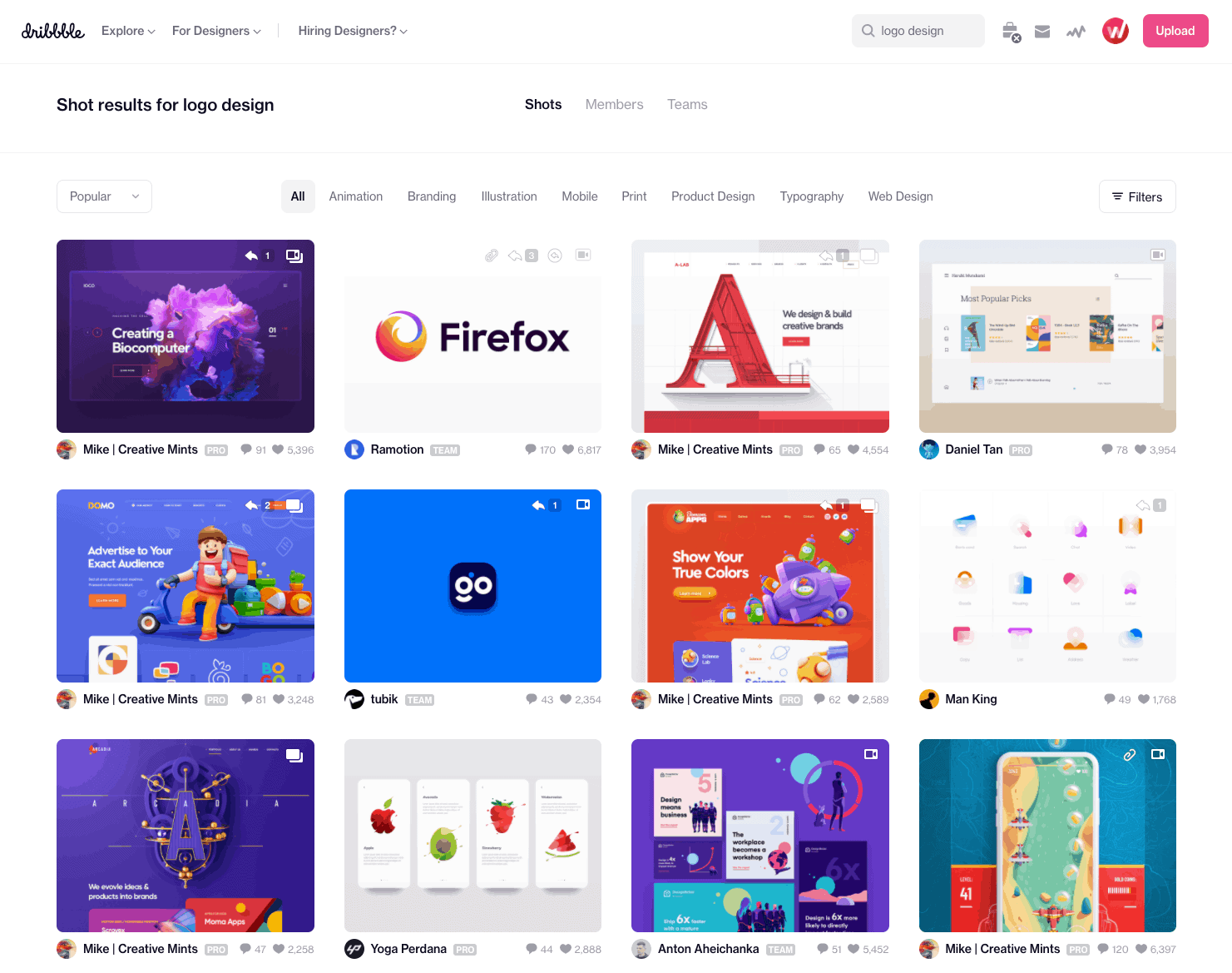
Logo’s on Dribbble
Another valuable approach is to study your competitors’ logos. Examine the techniques they’ve used and take note of what captures your attention. While there’s no need to replicate their style, analysing industry-specific trends will provide insight into what resonates with your audience. Pulling from several sources rather than copying one keeps your logo from blending in with the rest of your industry.
Create a Simple Logo Mood Board
As you collect inspiration, look for patterns rather than logos you simply like. Ask yourself:
- Which colours appear most often in your industry?
- Do competitors use icons, wordmarks, initials or badges?
- Are most logos serious and corporate, or more relaxed and playful?
- Which designs already feel dated?
- Which logos still work when shown very small?
A small mood board with colours, type styles, icons and competitor examples will give you a clearer creative direction before you start designing.
3
Do Your Research
Good research underpins logo design as much as any other part of building a brand. You need to investigate several key areas: Who is your target audience? What are their expectations? Which brands do they already engage with? How can you position your business to win their attention and loyalty?
Additionally, speak to your current customers to gain insights into their buying behaviours, lifestyle choices, and overall perceptions of your brand. These details help you pin down what the business is for and carry that through into the logo.
Brainstorm Words That Define Your Brand
What words do you want associated with your brand? A great way to start is by brainstorming relevant terms yourself. Ask your family and friends for suggestions too, as they often spot perspectives you hadn’t considered. You can also turn to online tools for inspiration.
For example, if you run a restaurant, typing “food” into thesaurus.com will generate a list of vivid and descriptive synonyms. You can even click on results to explore related ideas further. Continue this process to refine your list until you have a strong set of terms that clearly communicate your brand’s story.
Narrow Your Brand Words Down
Once you have a long list of possible words, narrow it down to three to five that really matter. For example, your brand words might be:
- Elegant
- Local
- Trustworthy
- Energetic
- Premium
These words can guide your design decisions. If one of your words is “premium”, you may choose a restrained colour palette, refined typography and plenty of white space. If one of your words is “energetic”, you may lean towards brighter colours, bolder shapes and stronger contrast.
4
How to Choose a Logo Design Style?
By now, you should have collected plenty of inspiration and developed a strong understanding of your brand’s identity. It’s time to turn that concept into a visual design.
The variety of design options, and the pressure to create something great, can be overwhelming for beginners. Take your time over this stage and do not rush it. The success of your logo will heavily depend on its visual style, so this is a stage that requires thoughtful attention and care.
The following are some of the popular logo design styles you can consider for your brand:
Retro Vintage
Retro and vintage logos are extremely popular, and for good reason. These styles evoke nostalgia and a sense of tradition, reminding people of earlier times. A retro design signals that you value heritage and conduct business the right way. Vintage logos are also visually appealing and tend to have a timeless charm.
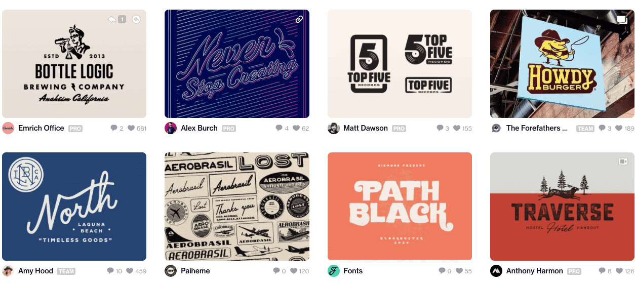
Classic Logos
If you are looking for a timeless design, then a classic logo is a strong choice. These logos appeal to a wide audience because they stay relevant over time, unlike trendy designs that may age quickly. Classic logos reflect humility, trustworthiness, and a sincere approach to customer service. They are typically simple, avoiding flashy fonts, complex graphics, or risky colour schemes.
Fun and Quirky
If your target audience is primarily younger people, a fun and quirky logo could be the right fit. This style creates a friendly and approachable vibe through playful illustrations and symbols. These logos are usually colourful and charming. For example, using a cheerful character or a whimsical mascot can show the lighter, more humorous side of your brand.
Modern and Minimalist
Modern and minimalist logos are ideal for businesses that want to communicate a sleek, up-to-date image. These designs often feature clean lines, minimal elements, and generous white space. This style shows that your brand is professional, progressive, and confident in its simplicity.
Handcrafted Logos
For brands that focus on handmade goods or artisan quality, a handcrafted logo style can strongly reinforce that image. This type of logo communicates individuality and authenticity. You can also mix handcrafted styles with retro elements for a nostalgic feel, or blend them with quirky styles for a youthful twist. When paired with modern touches, the result can be a refined, sophisticated look that still feels personal.
How to Avoid Choosing the Wrong Style
One common mistake is choosing a style because it is fashionable rather than because it suits the business. Trend-led logos can look good at first, but they often age quickly.
Before committing to a style, ask whether it fits your audience, your price point and the way customers should perceive you. A logo for a law firm does not need to look exciting. A logo for a children’s clothing brand does not need to look corporate. The design should match the business, not just the current trend.
5
What Are the Different Types of Logo?
The next and one of the most important steps in the logo making process is to choose the right type of logo. There are lots of types of logo, but below I mention the most popular 7 types. You can use any of these for your company if it complements the overall aesthetics, theme, and name of your brand.
Wordmark Logos
A wordmark logo only has your company name. Often referred to as a logotype, it is devoid of monograms or symbols. You should go for this type of logo if you have a distinctive or very short business name. The best examples of wordmark logos are Google, Burger King, Canon, Coca Cola, Calvin Klein, Braun, and so on.

Monograms
If your logo has only one to three letters, it is a monogram. Such a logo comprises the company’s first three letters or initials in the form of a symbol, with the full name below. Many famous companies such as BMW (Bayerische Motoren Werke), London Symphony Orchestra (LSO), Small Scale Cycles (SSC), and SSG Security (SSG) use this kind of logo. Companies like Louis Vuitton (LV) and Warner Bros. (WB) have dropped the third letter but still have iconic monogram logos.
Combination Logos
The combination logo, as the name suggests, includes both a symbol and a wordmark. Using two different design elements together makes your logo more recognisable. You can also cleverly overlap two different visuals into one logo to convey your message more creatively.
Combination logos are also the most common types of logos. Some of the best examples include Target, Huawei, Nike, Amazon, and Adidas.
Our own “Webpop Design” logo is a good example of a combination logo. We tend to suggest this type for small-business sites, because the full lockup works in the header while the symbol on its own works as a favicon and social avatar.
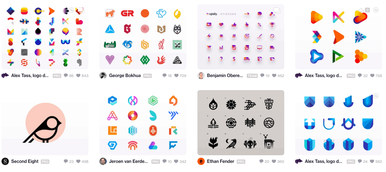
Logo Symbols
A logo symbol consists of an image that represents your company. These are often the most easily recognisable logos as they offer a unique visual identity for your brand. Logo symbols can range from intricate and detailed to very simple. You can also pair a symbol with a wordmark to increase brand recognition.
Mascots
One of the most exciting ways to personalise your brand is to use mascot logos. They normally feature cartoonish, colourful, and fun characters, resulting in an amicable and family-friendly logo. Perhaps the best example of mascots is the logo of Hostgator, a website hosting company in the States.
Abstract Logo Marks
Abstract logos enable you to design a unique as well as an entirely new image for your brand instead of repurposing existing images and icons. The image will be truly exclusive to you, making your brand even more recognisable. Understanding different geometric figures will help you further create a specific atmosphere, feeling, or mood through an abstract logo.
Emblem Logos
An emblem logo places text inside a symbol, badge, seal or crest. These logos often feel traditional, established or official. They are commonly used by schools, sports teams, breweries, car brands and organisations that want to communicate heritage or authority.
The downside is that emblem logos can become hard to read at small sizes. If you choose this type of logo, keep the details simple and test it as a social media profile image before finalising it.
6
How to Choose the Right Colours for Your Logo
The next step is to choose the right colours for your logo. Keep in mind that every colour has a different meaning. You can also express different ideas and emotions by using certain colours in your logo. Picking colours gets much easier once you have defined your brand’s purpose, personality and guidelines.
Some people design their logo in a single colour only. However, you must experiment with more than one colour to determine which combination works best for you. Whatever colours you choose, they should tell the complete story of your brand.
There are usually only three types of colour combinations for logos which are as follows:
Complementary Colours
Complementary colours appear directly across each other on the logo. It is best to use only two colours in this kind of colour combination. Used well, the two colours look dynamic and bring out the best in each other.
Analogous Colours
Analogous combinations mostly consist of three colours that lie side by side on the logo. These colours make your logo more harmonious and beautiful.
Triadic Colours
Triadic colours give a bold and stimulating look to your logo. You would normally use these colours in three equal sections on your logo, also making it a bit more organised and orderly.
Choose Appropriate Colours for Your Industry
It is also important to choose industry appropriate colours. For example, the colour yellow radiates feelings of happiness, confidence, optimism, encouragement, and amusement. Many companies, especially in the food industry (McDonald’s and Subway), automotive (Ferrari), and technology (Nikon) businesses have used yellow in their logos to great success. Yellow is also a great attention grabber and crowd favourite.
Red is another popular colour and it stands for excitement, strength, energy, power, and passion. You can also use classic colour combinations such as red and yellow and red and white to denote love, courage, and celebration. Red also boosts hunger and creates urgency resulting in impulsive shopping. That is why, companies such as Levi’s, Coca Cola, Lays, Canon, KFC, and Kit Kat have red in their logos.
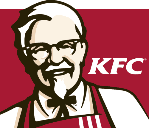
Some other common colours found in logos are green, blue, silver, brown, black, white, and grey. However, try not to use more than three colours because multiple colours make your logo confusing, disorganised and vague.
Your chosen colours must be compatible with your business and the target audience. For example, you must use brighter or darker colours which represent passion and energy if your customers are mostly young people. For senior citizens, try to pick light and soothing colours instead.
Test Your Logo in One Colour
A practical logo should still work in one colour. Before finalising your design, test it in black, white and greyscale. This is important because your logo may appear on invoices, letterheads, packaging, uniforms, signage or documents where full colour is not always possible.
If the logo only works when all colours are present, the design may be too dependent on decoration rather than shape.
7
How to Choose a Good Font for Your Logo
Your logo’s text will have secondary importance as long as your logo is primarily a symbol or monogram. You still need a font that can easily carry your company’s name if you ever want to use it independently on your logo.
Not many people pay attention to the logo’s font which is a mistake. The choice of font can make or break your logo. It says a lot about your brand and therefore, you must keep generic fonts at bay. Never use fonts such as Lucida Handwriting, Times New Roman and Comic Sans as they are too common.
The two types of fonts you can choose from are Serif with stems or Sans Serif with no stems on letters. Both free and paid fonts are available. The best place for free fonts is Google Fonts. However, a lot of designers, companies, and websites use their fonts. Therefore, finding a custom font for your logo is rather difficult. On the other hand, you can buy some really good yet inexpensive fonts from websites like Creative Market. They offer a wide range of affordable custom fonts for every kind of use.
Keep Your Logo Readable
A logo font should look good, but it also needs to be readable. This is especially important if your business name is long, unusual or easy to misread.
When choosing a font, test your logo at different sizes. Look at it as a website header, a mobile menu logo, a social media profile image and a small footer logo. If people cannot read the name quickly, choose a simpler font or adjust the spacing.
You should also avoid using too many fonts. In most cases, one or two typefaces are enough. If you use more than that, the design can start to feel messy.
8
How to Design a Logo on a Free Design Platform
The next step after picking the style, type, colours and fonts is to design your logo. One option at this stage is to hire an experienced logo designer from websites such as 99designs.com. Having built hundreds of websites over the years, our honest take is that a DIY logo is fine while you are testing an idea or just getting started, but once you are investing in a proper website a weak logo tends to undermine everything around it. Alternatively, you can use numerous resources, software and websites to create a logo yourself. Some of these resources such as Photoshop are paid. However, there are also some fantastic free tools you can use to design your logo.
You can start with Squarespace Logo Maker if you are looking for a modern and minimalist logo. Creating a logo on Squarespace is extremely straightforward. Just go to the homepage of Squarespace Logo Maker, enter your brand name, select a tagline, and search for relevant symbols if you want to include any. Now, you have a very basic logo to work with. You can further customise features like font family and style, fonts’ and symbol colours as well as the layout, alignment and size of the shapes and text. Finally, Squarespace also allows you to download your logo in low or high resolution for free.
Similarly, Shopify Logo Maker, previously known as Hatchful, helps you design a perfectly good logo from start to finish by asking questions about your preferences all the while giving helpful tips along the way. It is particularly useful for people with no idea of how to proceed or those who are stuck at a certain stage of logo making.
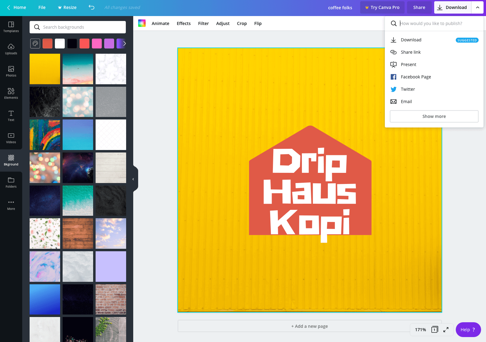
You can also use Canva which in my opinion, is the best and most popular free DIY logo design tool. Creating a logo on Canva is also a breeze. Below I will walk you through the process of designing a logo on Canva.
Creating a Logo with Canva
Start by creating your free account on Canva. Subsequently, you will get a blank white canvas once you log in. There are also lots of templates to choose from on the right hand bar. Browse through these templates and choose one which suits your brand. You can also customise your chosen template according to your logo requirements, guidelines and colour choices.
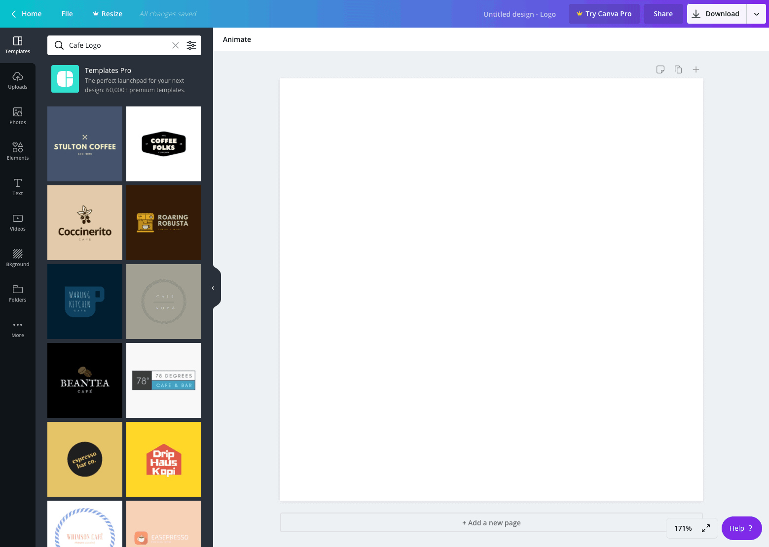
Alternatively, you can go straight to the Elements tab to design a logo from scratch. The Element tab offers you a large selection of icons and graphics. Once again, explore through them to choose the best icon or graphic for your logo. You can also customise the position, colours and opacity of each icon.
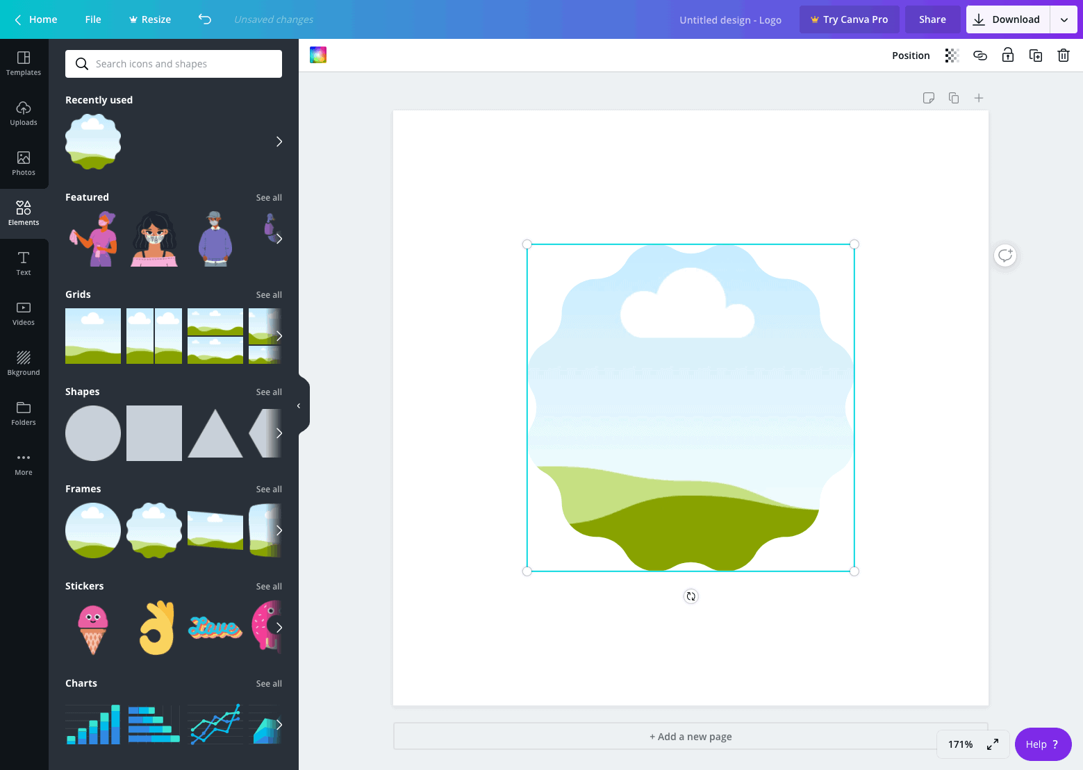
Also, explore the Text tab if you want to create a text based logo. This tab provides you with different text compositions allowing you to experiment with different font hierarchies and combinations as well as preview the results. You should ideally have a clear idea of your text composition beforehand. It will help you add text to your art board and start styling it straight away.
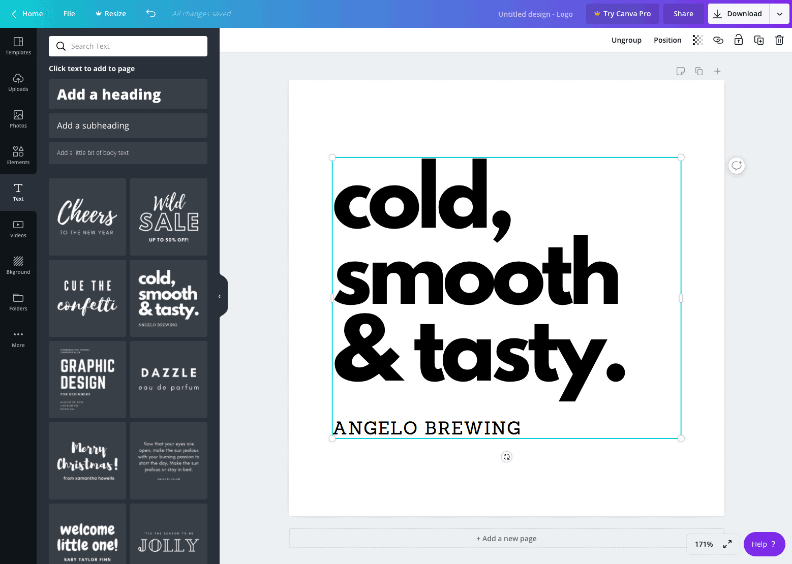
Canva also allows you to customise each font in the Fonts tab. Some of the features you can change include text size and colours. You can also upload additional fonts to Canva if you can’t find the right font to use from their collection.
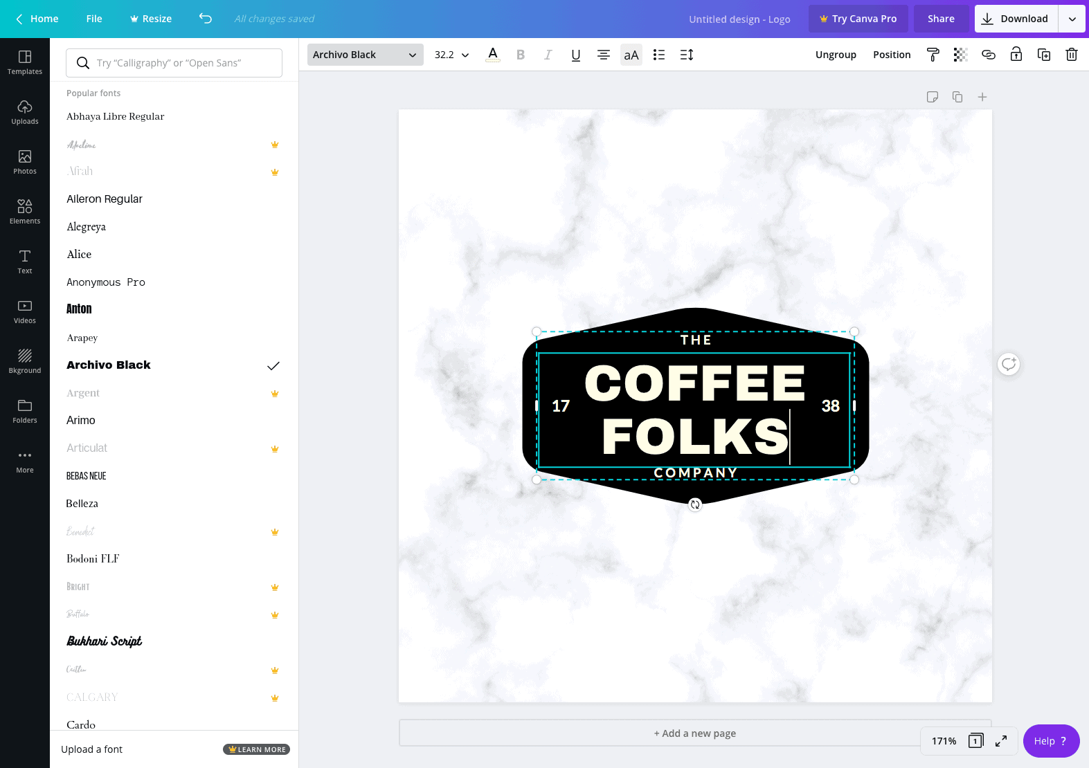
Canva has a Download button in the top right corner to import the logo. All you need to do is select the file type and click the button and boom, you have created your very first logo.
Check the Licence Before Using Icons or Templates
Before using a DIY logo commercially, check the licensing rules of the platform, template, icon or font you used. Some free assets may be fine for general design work but not suitable for exclusive logo use. This matters because your logo should ideally be unique to your business.
If you use a template, customise it heavily enough so it does not look like the same logo hundreds of other businesses could use. Change the layout, typography, colour palette and icon treatment until it feels specific to your brand.
9
Striving for Perfection
Your logo is the foundation of your branding, so it is worth getting right. The only way to check whether or not your logo can present you as a new and exciting venture is to integrate it on every marketing item such as your website, business cards, and brochures, etc.
You may not get the logo you want on the first attempt. You have to give it a few tries before you get it perfect, especially if you are not an experienced logo designer. Don’t worry if the first attempt falls short. Adjust it and keep going until it feels right.
You have two options if you are not satisfied with your first logo. You can either start from scratch again or just introduce necessary changes to the design. For example, you can change fonts, shapes, or colour palettes to see if they work the second time around. You can also try a new design tool altogether with a lot of templates and pre-made designs. They can greatly help you get the perfect logo.
You have to repeat the whole process from taking inspiration to designing a logo if you decide to recreate the logo from scratch. Going through the process more than once gets you closer to the right logo and sharpens your eye for design at the same time.
How to Test Your Logo Before Finalising It
Before you commit to a design, test it in several real situations:
- Place it in your website header.
- Use it as a social media profile image.
- View it on mobile.
- Print it in black and white.
- Place it on a business card or flyer.
- Show it on a dark background and a light background.
- Reduce it to a very small size and check whether it remains readable.
A logo that only looks good at one size or in one setting is not finished. It needs to be flexible enough to work wherever your brand appears.
Common Logo Design Mistakes to Avoid
Many DIY logos fail because they try to do too much. Watch out for these common mistakes:
- Using too many colours.
- Choosing a font that is difficult to read.
- Copying a competitor too closely.
- Using generic icons without customisation.
- Relying on trends instead of brand fit.
- Making the logo too detailed for small sizes.
- Using low-resolution files on your website.
- Forgetting to test the logo in black and white.
If you avoid these mistakes, your logo will already be stronger than many beginner designs.
10
Upload Your Logo to Your Website
It’s really easy to upload a logo to your WordPress website. First of all, you have to sign in to the WordPress dashboard. Now, go to left side menu, click on Appearance and then Customise.
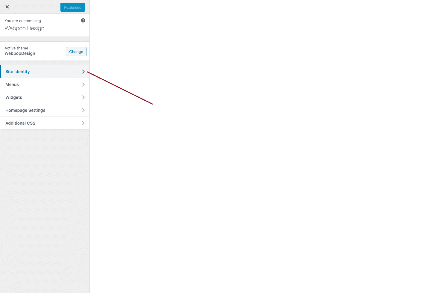
Different WordPress themes have different settings. However, all of them have the Site Identity tab in the Customisation area. You will come across different website settings within the Site Identity tab, including the option to upload or re-upload your logo.
Click the Publish button at the top once you have uploaded the logo. Now, your visitors can see your new logo on your website.
Which Logo Files Do You Need?
Before uploading your logo, make sure you have the right file formats. Different platforms and uses may require different versions.
- SVG – Best for sharp, scalable website logos where supported.
- PNG – Useful for transparent backgrounds and general website use.
- JPG – Suitable for simple previews, but not ideal for transparent logos.
- PDF – Useful for print, sharing with suppliers or keeping a high-quality version.
- Favicon – A simplified icon used in browser tabs and bookmarks.
When we start a build, we usually ask clients for an SVG, a transparent PNG fallback and a single-colour version, so the logo stays sharp on high-resolution screens without anyone chasing files later. It is worth getting this right for performance too. A logo exported as one oversized PNG is a common drag on page load, whereas a clean SVG is often a fraction of the size and stays crisp at any scale.
You should also export different logo variations if possible:
- A full colour logo.
- A black version.
- A white version.
- A horizontal version.
- A stacked version.
- A small icon or favicon version.
Having these versions ready will make your brand easier to use across your website, social media, documents and marketing material.
Logo Design Checklist
Before you publish your new logo, use this quick checklist to make sure it is ready:
- Does the logo suit your business and audience?
- Is it simple enough to recognise quickly?
- Can people read the business name clearly?
- Does it work on both light and dark backgrounds?
- Does it still work when reduced to a small size?
- Have you checked it in black and white?
- Have you avoided using too many colours or fonts?
- Does it look different enough from your competitors?
- Do you have the right file formats for web and print?
- Have you checked the licence for any icons, fonts or templates used?
Wrapping Up
So there you have it, that was my DIY guide to designing a logo. I hope you have found it helpful. Logo design software and logo design services have come on in leaps and bounds, and they are far more accessible and better quality than they used to be. Follow this guide step-by-step and you will have yourself a logo in no time.
However, if you are still struggling to design a good logo using Canva, I’d highly suggest using a service like 99designs. You can set a “prize” amount reward and get hundreds of logo designers all battling out to design the perfect logo for you. At the end, you’ll have a wide selection to choose from and at an affordable rate.
DIY logo design FAQs
Can I design a logo myself?
Yes, you can design a logo yourself using tools like Canva, Shopify Logo Maker or Squarespace Logo Maker. The key is to keep the design simple, readable and relevant to your audience. A DIY logo may not be as unique as a fully custom professional logo, but it can still work well for a small business, side project or early-stage brand.
What is the easiest way to design a logo?
The easiest way is to start with a clear brand direction, choose a simple logo type and use a beginner-friendly design platform. Templates can help you get started, but you should customise the colours, fonts, layout and icon so the final logo feels more distinctive.
What is the best free logo maker?
Canva is the most popular choice, with a large library of templates, icons and text options. Shopify Logo Maker and Squarespace Logo Maker are also useful for simple, beginner-friendly logos. The best tool depends on the style you want and how much customisation you need.
How many colours should a logo have?
Most logos work best with one to three colours. Too many colours can make the design look cluttered and harder to use across different formats. You should also make sure the logo works in black and white.
What font should I use for a logo?
Choose a font that suits your brand and remains easy to read at different sizes. Serif fonts can feel more traditional or refined, while sans serif fonts often feel cleaner and more modern. Avoid overly decorative fonts unless they are genuinely appropriate for your audience.
Should my logo include an icon?
Your logo does not have to include an icon. A wordmark can work well if your business name is short, distinctive and easy to remember. An icon can be helpful if you want a symbol for social media profiles, favicons, packaging or app-style uses.
What file format should a logo be?
For websites, SVG and PNG are usually the most useful formats. SVG files stay sharp at different sizes, while PNG files are helpful when you need a transparent background. For print, you may also need a PDF or other high-quality file format.
How do I upload a logo to WordPress?
In most WordPress themes, you can upload your logo by going to Appearance, then Customise, then Site Identity. From there, you can upload the logo file and publish your changes. Some themes and page builders may place this setting somewhere different, but Site Identity is the most common location.